I have spoken quite often about the technique I used for the illustrative animation style in my ASU1 film roughly titled ‘just one more place to look’ , I work on a wacom tablet, and have done for years, as this gives an intuitive and freehand feel to any kind of graphics that I might create, many years ago when I first used illustrator I remember struggling with the anchor points and the vector pen tool, but now it’s almost as if I am drawing with a pencil.
Whilst on my BA degree course I did a lot of life drawing and my favourite technique was just picking two colours from my oil pastels to denote the planes of the figure in front of me and I was so successful at this, one of the examiners asked why I was doing animation when he thought my life drawing was the star of my degree show.
Now with these many years of the above techniques under my belt I can very quickly interpret figures into coloured planes with a highly stylized and effective result.


these images were created to show the diversity of courses at City College for a poster campaign and show my technique at it’s best, not photographic, but recognisable with a style all of their own.
This is where the look for my animated character in the film originated and throughout the 1286 hand-drawn frames I tried to make each and everyone as a beautiful ‘cel’ in it’s own right.
A still from the market scene.

Still from the church walk section.

Still from the slope rotoscope section.
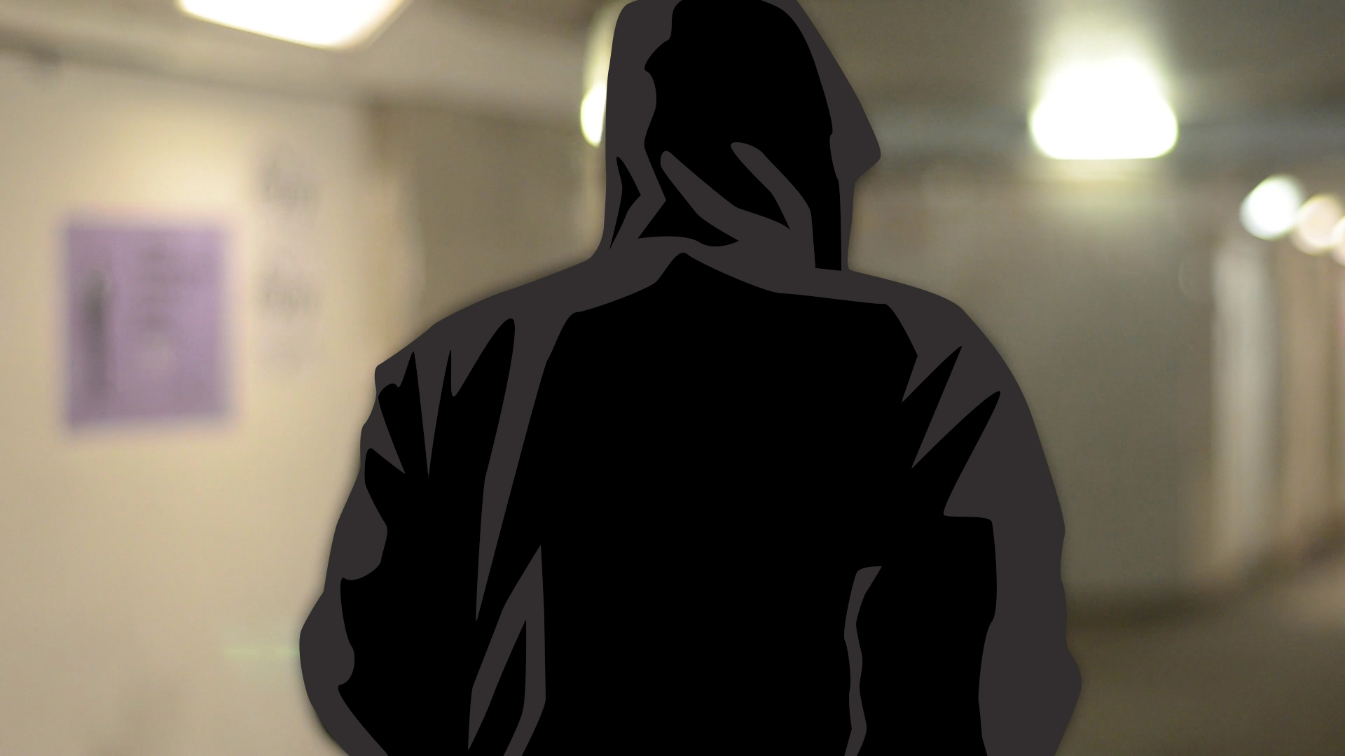
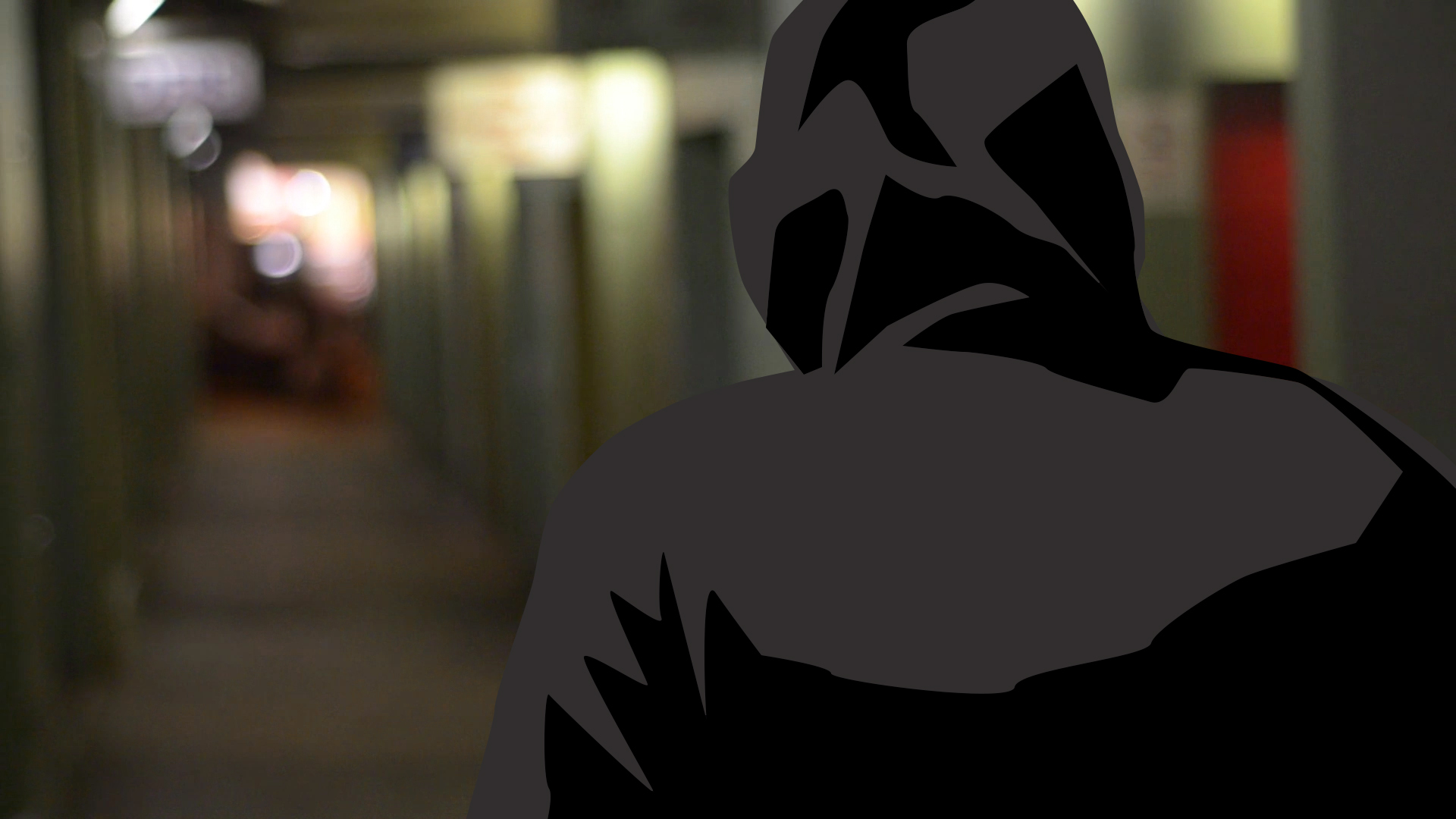
Still from the subway section.

Above is a screenshot of some of the hundreds of thumbnails I produced.

Leave a comment